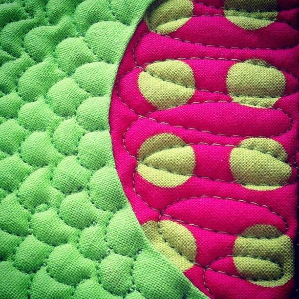
Quilting with Pantone Color of the Year: Greenery
 For many quilters (myself included), quilting is really all about color: celebrating our favorite colors, combining colors in pleasing and sometimes surprising ways, and discovering exciting new colors we’ve never quilted with before.
I am always interested and usually surprised by the announcement of the color company Pantone’s Color of the Year. This year’s color is Greenery, a springy green that seems to embody optimism, freshness, and everything that’s new. If you’re serious about colors, you might be interested in Pantone’s long article about all the meanings of Greenery. (I have to confess that it was too long for me to read it all.)
As a quilter, I was more excited by this set of color palettes from Pantone that showed a variety of different ways you can combine this unusual green with other colors. We hear from many quilters that they worry about whether the color combinations they choose really look good together. If your color confidence is shaky, here are some suggestions from the real color experts! Notice how the same color can help create many different color moods. The magic is in the combinations.
And of course, there are many, many quilts that use colors similar to Greenery. A light, yellow-gray green is a favorite color with modern quilters. Here are a few examples I found on the Web that cover the spectrum from silly to splendid, and from traditional to modern:


A Good Affair, an event planning website, offers one more inspiring look at Greenery. Wouldn’t you feel hopeful about a marriage that starts with this color as its theme? Visit the post to see many beautiful photos of wedding greenery.


